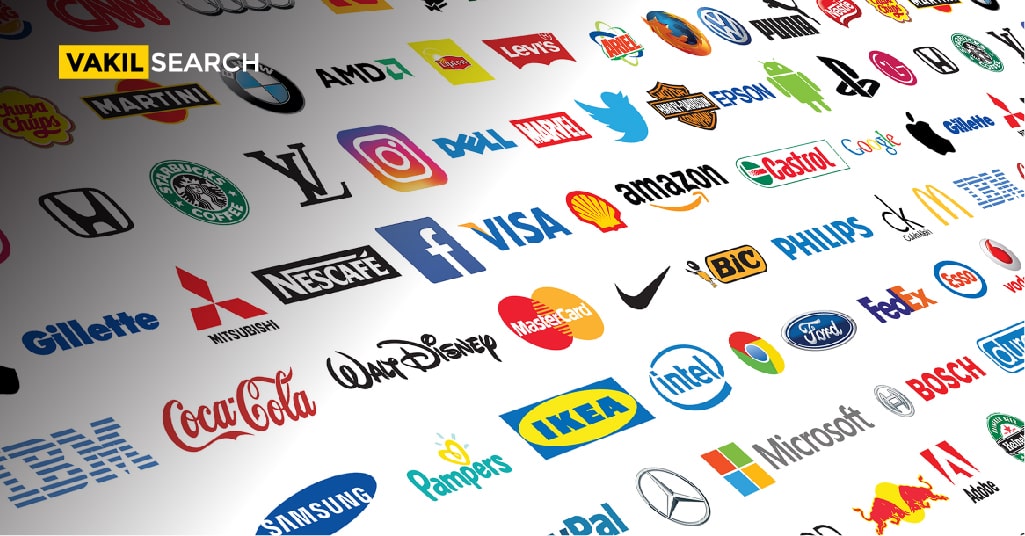
From Amazon to Cadbury’s, brands have for centuries which been irrevocably tied to the products they manufacture; but some last longer than others.
A logo design gives character to a company and helps in increasing the brand value considerably. It helps customers instantly connect with your brand and the products.
Can you imagine famous companies such as Adidas, Cadbury or Amazon without their signature logos? Without logos, how would they be recognised?
Logo design is an important step for every company’s marketing and brand strategy and is one that cannot be ignored. Having the right logo goes a long way in helping companies retain customers, acquire new ones, increase visibility and attain a loyal customer base. A logo is any graphical representation containing a unique symbol or unique font or both that makes it easy for customers to identify the brand.
Keeping that in mind, let’s take a look at some of the world’s most famous logos, and see what we can learn from them.
Apple
This iconic logo that is recognised around the world was bound to be on this list, as there are very few millennials who don’t automatically think of Steve Jobs or their dream iPhone when they look at this. The classy Apple logo was actually designed in 1977 by Rob Janoff and has stood the test of time due to its innovative and simple approach. The first thing you notice about the logo is that the apple isn’t whole, but rather missing a piece on its top.
Not only does this simple detail help arouse curiosity it also helps add depth to the logo. The legends regarding the bite vary from it being a biblical reference to Adam and Eve biting into the sinful apples to the legend that it is, in fact, a pun on the word ‘byte’. While these urban legends have quite a fan following, the logo creator Rob Janoff, had a more sensible reason for including the bite.
The company wanted a logo that could scale, and when Janoff tried to incorporate a full apple, he realised that when it was shrunk, it resembled a cherry more than an apple.
By introducing a bite into the apple’s design, Janoff was able to scale the logo without compromising on brand identity. Another thing we can learn from Apple is that sometimes, practicality needs to win over design aesthetics and that there are times when you can design a logo that doesn’t have a lot of meaning, as long as it is good! You Can the Best Logo for your Business Online.
Adidas
We all love this sports brand, and their logo stresses lesson one; that a logo does not have to be literal. Just because a particular brand deals in a commodity, does not mean they have to make it a part of their logo design. The Adidas logo, more commonly known as the Trefoil logo, began as a design drafted by the company’s founder Adolf Dassler and became a part of their running shoes in 1949.
The three stripes which are now synonymous with the brand had no particular meaning and were used as a way to gain brand publicity back in the 1940s. It was in the 1970s that they gained more definition and became the three-leaf shaped logo that we are now familiar with, and this happened when Adidas started making comfortable clothes and leisurewear. The three leaves, in fact, symbolise the landmasses of the Americas, Europe/Africa and Asia, and the hidden meaning is one you wouldn’t notice unless told about.
In the 1990s the logo was further improved, and it became the logo we now use and see, and is a staple in all sports goods manufactured by the company. You Can also Know about the Trademark Registration Process Online.
The Adidas logo isn’t loud or eye-catching but is memorable yet not literal. This teaches us that sometimes, the best thing to be is not very obvious. Logos don’t need to spell out your brand name or make explicitly clear what you sell. Sometimes, logos need to just be memorable.
Cadbury
Cadbury is a classic example of a company that owns a colour to its name! The Pantone 2865c is the colour of their logo and was patented by the company to prevent forgery by rivals. The design is quite simple and is based on William Cadbury’s signature. This logo teaches us that in certain cases, sticking to something that is personal and relevant to the company history can help in gaining publicity and loyalty.
While the design first appeared in 1921, it wasn’t used on all their products until 1952. Since then it has undergone several changes and minor edits, but the basic nature of the logo remains the same, including its distinctly purple colour. Including the founder’s signature in the logo helps give the company a warm, relatable and personal touch that helps customers trust the company. Other companies which have successfully sued the same technique are Coca-Cola and Disney Studios.
Nike
Nike’s Swoosh is easily one of the most recognized logos of all time and was first used by the company in 1971. It is quite surprising and interesting to note that the Swoosh was designed by a young, inexperienced graphic design student named Carolyn Davidson for a sum of $35!
The company’s only requirement regarding the logo was that it should convey the message of motion and that it should be as different as possible from the Adidas logo, as they were core rivals at the time.
Tight deadlines and too many options led to the Board hurriedly rushing through logos and going with the Swoosh. Phil Knight, Nike’s founder had remarked at the time that while he doesn’t love the Swoosh, it might be something he would grow to love. The Nike logo origin story teaches us that sometimes the right logo doesn’t stand out in the first look. Rather it needs several glances and looks to gain customer attention. But once it does do so, it stays with the customers for a lifetime! CEOs must, therefore, go with the flow on certain occasions instead of analyzing and cross-referencing every option they get.
Amazon
Jeff Bezos wanted the Amazon logo to convey the message that the company would host everything any customer wanted on their website.
Turner Duckworth who worked as the logo designer started out by adding an arrow to the brand name to suggest that Amazon could deliver products you wanted to you. Since the company existed on an online platform, Bezos felt that it would be best if they could somehow incorporate a human element to the logo, and so the arrow turned into a smile!
The key takeaway here is that in certain cases having a not-so-obvious logo can, in fact, do the brand image a lot of good. For instance, the Amazon logo has been in the picture for over 17 years now, and yet people sometimes never see the smile on their logo or the fact that it is actually an arrow. But this doesn’t mean that the purpose of the logo is defeated.
In fact, it is quite the opposite. Just like with the negative-space created arrow in the FedEx logo, such subliminal messaging help conveys the message that a brand wants without being too crass or obvious. This just goes to show that sometimes subtlety leads to success.
These logo stories prove that different circumstances call for different options. At the end of the day, it is up to the CEO and the Board to choose what they feel best represents their company.
The fact is that there are several options and routes they can take; from being literal in some cases to depending on subliminal messaging. Use these lessons to create the logo of your dreams, and let us know in the comments below if there are any other iconic logos you feel should be on this list.
Read More:-


